Size and Shape Matter for Performance
There are multiple sizes and shapes for banner ads, and some perform better than others. According to Google, these are the top-performing kinds:
- 728×90 Leaderboard: Its pros include more ad inventory availability and placement above the main content.
- 336×280 Large Rectangle: It performs best when embedded within text content or at the end of articles.
- 300×250 Medium Rectangle: It also sees better results when placed within text or at the end of articles.
- 300×50 Mobile Banner: It fits larger mobile phone screens at the top or bottom.
- 160×600 Wide Skyscraper: It works best along sidebars of webpages.
This is a wide range of sizes that will need unique designs. Using multiple variations will help advertisers reach audiences on different devices. Even though size will limit the images and text of each banner ad, the ads should all be cohesive.
Deliver a Clear Value Proposition
The value proposition must be crystal clear for a banner ad to deliver results. It’s why people would click on the ad. It also needs to be concise. Some examples include:
- Discounts
- Limited-time promotions exclusive to those who see the ad (i.e., BOGO, free gift with purchase, kids eat free, etc.)
- Pricing, in general, that’s appealing (i.e., family meals start at $15.99, dresses for women $19.99-$39.99, etc.)
- Results the company can deliver (i.e., service calls answered within 24 hours, whiter teeth in one session, etc.)
To the right is a simple example with free shipping as the value prop.

High-Quality Imagery Is About More Than Pixel Size
The imagery in display ads is generally small but should have a great impact. Using professional images is the first point. However, there’s more to consider and advise your customers about, including:
- Use the natural lines of an image versus visually skewed ones.
- Look at proportion. This is especially important if you have multiple images, such as a logo and a product shot. They need to be in proportion with each other on every banner ad size.
- Avoid washed-out filters. While it may look good in other types of ads or on social media, it will appear grainy and low-quality in banner ads.
- Keep edges and borders transparent instead of using rounded edges, which can block out some of the images.
- Stay away from excessive filters or inverted colors.
- Focus attention on images representing products or services. Being abstract often creates confusion.
- Stick with a single central image instead of a collage.
- Don’t use digital composite backgrounds, as those may render wrong. Instead, use photos that have physical settings and organic shadows and lighting.
The ad from Honda to the right covers all the image best practices.

Overlaying Is a No-No for Banner Ads
Remember, these are compact and small banners. Overlaying logos, other images, buttons or text on the main image will be too busy or distracting. It’s best to keep all these elements separate in banner ads. If you put the button on top of the image, it may not be clickable. Users may think it’s invalid and move on.
The Most Clickable CTAs
The CTA (call to action) is action-oriented; it’s what advertisers want customers to do. It can include the value proposition, like “Save 20%” or “Get your free visit.” It can also guide what the customer should do, such as “Watch now” or “Register here.”
CTAs need to be short and placed in a button at the bottom of ads or include an arrow. In many cases, there’s a pop of color on the button or a different font.
In a nutshell, banner ad best practices for CTAs are to make them short, actionable, clear and stand out. There should be no mismatch between the CTA and the landing page. If the offer isn’t present on that page, the click will be a waste.
The Cisco Webex banner below uses “Sign up free” as the CTA. There’s no confusion about what you get by clicking.

Simple Animation Can Drive More Engagement
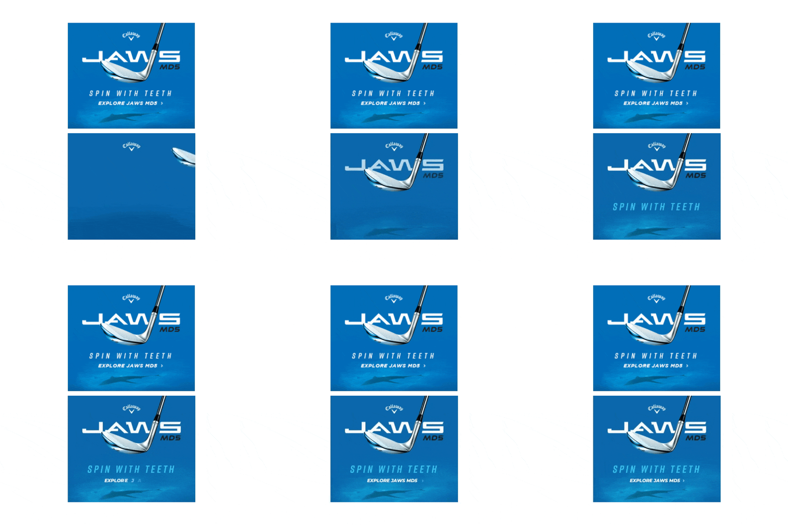
Some subtle animation on a banner ad can be eye-catching. The trick is to ensure it’s simple and doesn’t detract from the message or offer. With the ad having such a small footprint, over-animation won’t deliver results. It should also be natural; don’t animate an object that wouldn’t move that way in real life. To the right is a neat example from a golf club brand.

Personalize Messaging as Much as Possible
Because you can target display ads in several ways — geography, demographics, previous activity, etc. — you don’t have to make a “one ad fits all.”
Help your advertisers define whom they want to see their ads and would most need their products and services. If your customer has a fitness franchise that caters to women, the ads should reflect this. They may outline different groups within that wide demographic — working moms, 20-somethings and recent retirees. You can propose a campaign that includes display ads showing all these types of women with relevant messaging.
Also, consider how ads may need to look different to users during their buying journey. For example, a user may see different ads depending on actions. Someone who has visited the advertiser’s website could see a variation of the ad now that the user has more awareness of the business.
Finally, being location-specific can matter. If your advertiser has locations in several metro areas, their customers will look somewhat different. Using the name of the city or imagery from it makes the ad feel more personalized.
Use Humor If It Makes Sense
 Injecting some levity into banner ads can be a great tactic, but it should be on-brand. If the company uses humor in various channels already, it makes sense. If not, it will seem like a reach that doesn’t correlate to the business’ culture.
For example, it would work to be fun with ads for quirky retailers or local bars known for their sense of humor. However, humor could be in poor taste for more serious businesses like financial planners or people that are called on in emergencies like plumbers.
Banner Ad Best Practices: Wow Your Advertisers with Ideas That Work
When working with advertisers, your expertise on creative is a big part of the value you bring to the table. These companies may hear the same story every day about slapping a logo on a display ad and calling it good. When you come to the table with better ideas, it builds trust and deepens your relationship. It differentiates you from the rest, which can win you their business for now and the future!


