

The average person spends six hours consuming media in the U.S., so there is ample opportunity to meet people where they are in the digital space. Of course, this means digital advertising is everywhere. Consumers encounter ads hundreds of times a day and, in turn, become “ad-blind.” With such competition for attention, advertisers must evolve display ad design beyond slapping a logo on a banner if they want their ad to stand out and get the click.
Minutes interacting with digital media per day
Here are some ideas applicable across many industries that can help enhance the design of display ads.

Ad Structure
The space for a digital ad varies, but most of the time, you don’t have a lot of real estate. According to Google, the ad sizes with the best performance are 300 x 250 (medium rectangle), 728 x 90 (leader board), 300 x 600 (half page) and 336 x 220 (large rectangle).
Because of the variance in size, you’ll need to create a flexible structure. In this structure, you should consider the placement of:
- Logo
- Value proposition
- Image
- CTA button
These are the four foundational elements of your structure. What are the most crucial parts?
The value proposition and CTA are what will propel action from consumers. You can make them stand out by making the image a background and the text bolder for better readability. Another way to add emphasis is to make the CTA button a prominent accent color.
The logo is the least important component, so it should be a secondary design element.
Color
Display ad design includes choosing the right colors. Your advertisers likely use their brand palette if they have one, but many don’t. If that’s the case or if your client is open to it, you should look into the psychology of color.
People do like some colors more than others. For example, a study found that men prefer blue and green, while women rate blue and purple as their favorites. Beyond their preferences, most people connect colors to emotions.
When helping design an impactful display ad, consider who the audience is and what you want them to feel. Is it compassion, urgency or maybe excitement? Identify the emotion, and connect to it through color.
Another thing to keep in mind is using a maximum of two to three shades. Any more than that, and it becomes distracting. Use colors purposefully, and ensure they complement each other.
Font
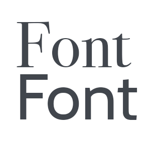 The next design element to consider is font. Your customers may or may not have a brand font. If they do, you should evaluate how legible it is in small sizes. The company logo may or may not be in that font.
The bottom line on typography is that it needs to be very clear. It should also pair well with the font in the logo. You can play with weight and size as well. Making certain words bold so they stand out could catch a scroller’s eye if that copy corresponds to their pain points.
Don’t get too busy. Two fonts should be the limit. Following good design principles, you should create a hierarchy with font based on size and weight. Your button CTA words can be the largest font size since that’s the action-oriented part of the content.
Choosing fonts can be overwhelming, considering all the possibilities. Check out this list of font combinations for inspiration.
Imagery
The image is the last part of a display ad. It should drive a connection and be relevant to the brand and offer. Using a picture just to take up space isn’t a good reason to use it. Instead, focus on something a consumer is likely to remember.
Images can communicate valuable information. If possible, custom ones work better than standard stock photos. If a physical product is the point of an ad, a high-quality picture highlighting its features or showing someone using it will be key.
If you are communicating an idea or service, you can take a standard stock photo and edit it to reflect the advertiser’s message better. Being creative is a must.
You’ll also want to think about imagery and how it relates to the landing page that links from the ad. It should be similar, so consumers don’t feel like they went to the wrong website when they click.
Here are a few closing thoughts on imagery: It should be professional, timeless and relevant. When you follow these best practices, your clients will have better-performing ads.
Simple Is Better in Display Ad Design
Display ad design may seem a bit complicated, but the first rule is to keep it simple. That doesn’t mean the minimalism of a logo and CTA. Rather, stick with something compelling, clear and concise. You don’t want to overwhelm viewers with too much because they’ll quickly abandon interest.
In short, the value proposition must be straightforward and drive action. The CTA needs to be clear, and imagery should be impactful. Once you start changing out some of the creative, look at the performance of ads to determine if they improved conversions. It’s something you’ll want to keep refining as you collect more data.
If you’re looking for more ideas on display ad design or other tips, subscribe to Aspire, written by and for broadcast and media sales experts.
You can also find creative samples by industry. Just visit the Ad Categories section, and click on each sector.


